PERFUME ADVERTISEMENT
VIDEO CLIP FOR THE CAMPAIGN OF THE PERFUME “THE C”
-
How often do we wish we were somewhere else right away? A place where words like desolation and stress do not exist. The perfume “the C” is designed to immerse the user in a world full of harmony, freshness and inner peace.
-
This advertising campaign is all about the positive change in mood that occurs when the perfume is used. The title “The C” (the change) therefore refers directly to the positive effect that is triggered when the fragrance is sprayed.
The fragrance enables the user to escape the dreary, stressful and monotonous gray everyday life and to drift away to a fresh imaginary place that radiates calm, balance and inner peace.
Off Text: “Sometimes all i need is a place where i can be free to escape reality. A spark of magic. In these moments i feel like most alive and far away from this world. But i know the place i'm trying to find is just a feeling. Change the way you feel - the C”
-
Video clip for the advertisement campaign of the perfume “The C” // Idea and conception of the video clip // Script // Direction // Cinematography on set // Creation of the story board // Model casting // Idea and creation of the off text
22s length


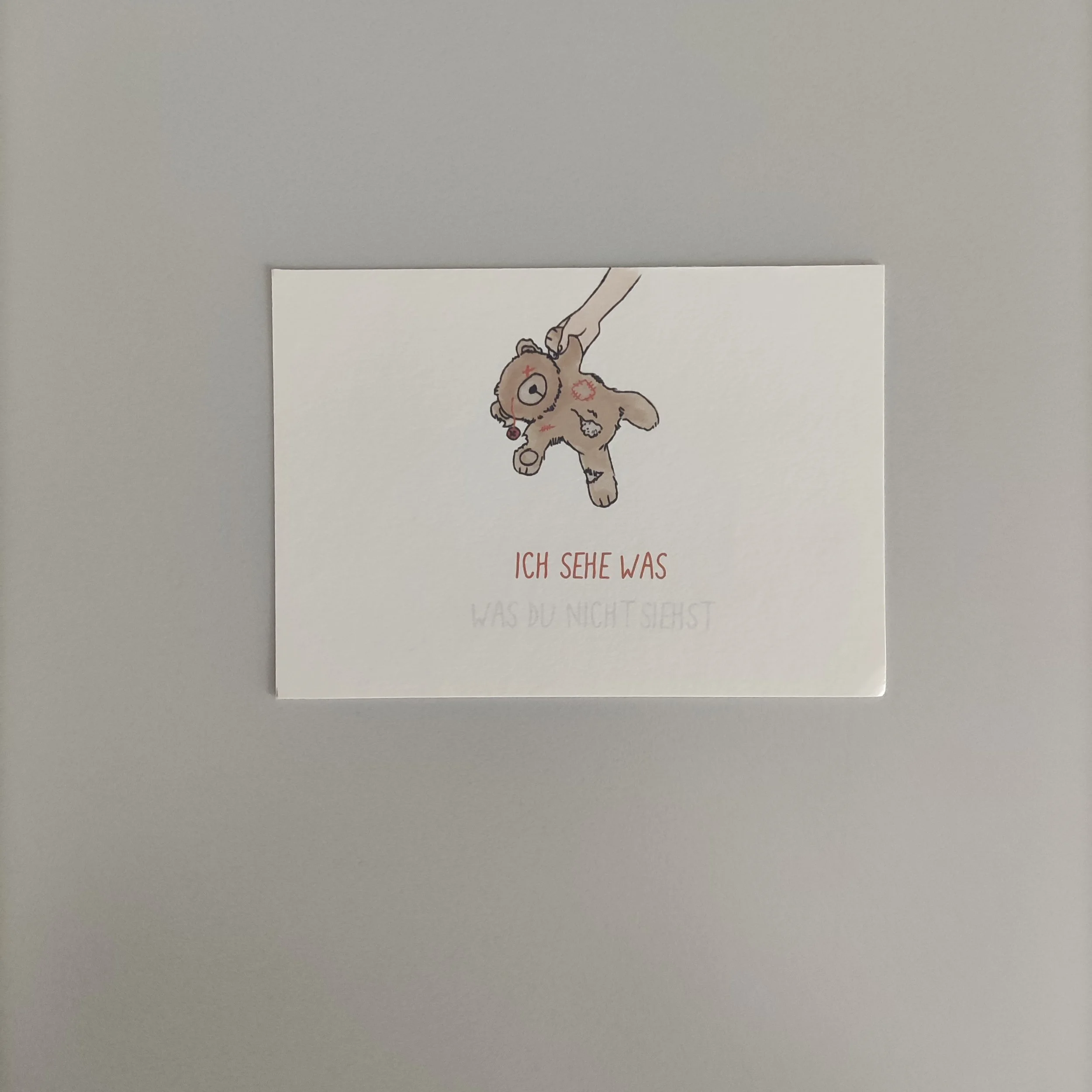
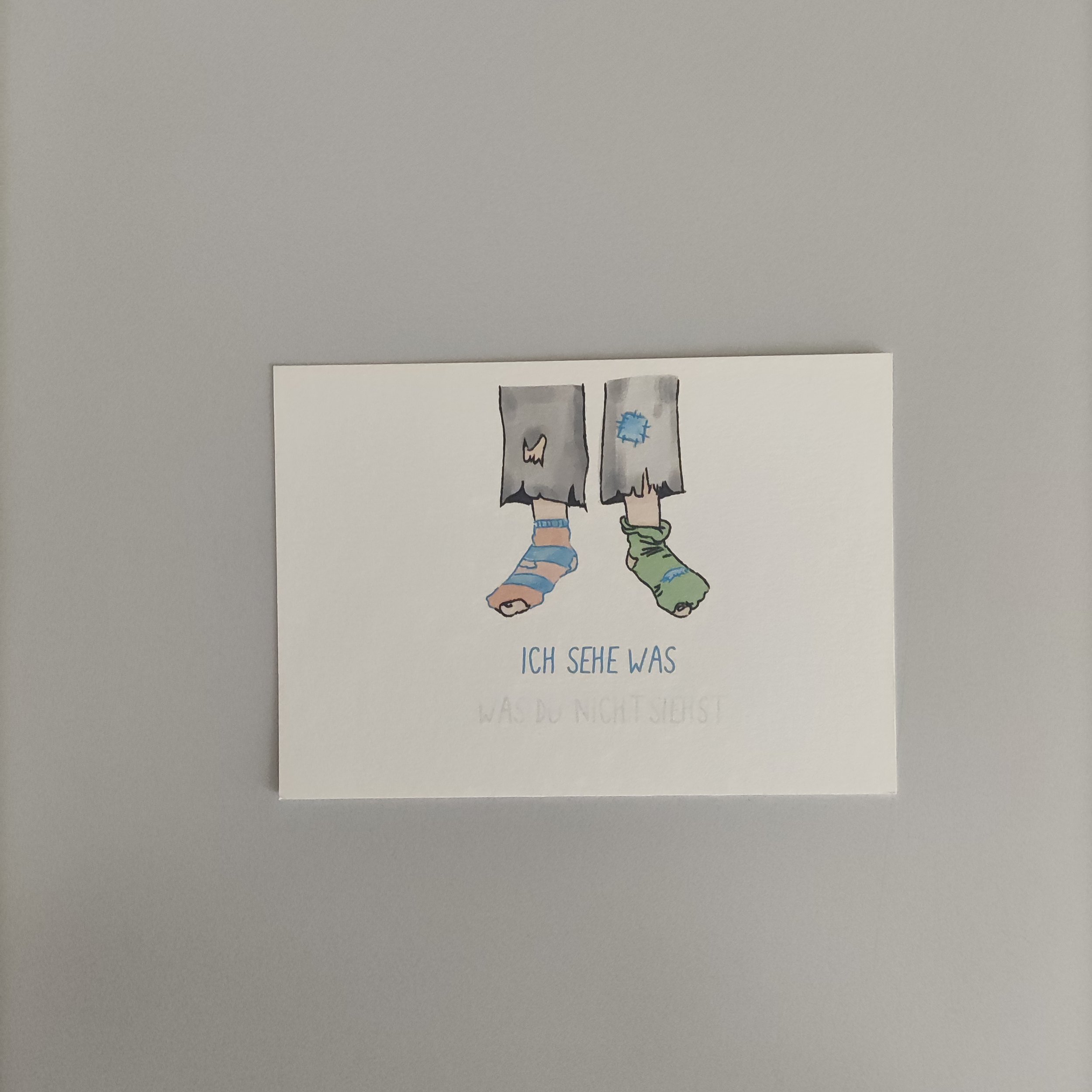
ICH SEHE WAS -
WAS DU NICHT SIEHST
PRINT CAMPAIGN TO CREATE AWARENESS AROUND THE ISSUE OF CHILD POVERTY
IN OUR SOCIETY
-
The problem of child poverty within our wealthy German society is well known, but not always visible and therefore usually goes unnoticed. With this in mind, a print campaign was developed to raise the awareness of this problem.
-
With the title “I see something - what you don't see” (german: "Ich sehe was - was du nicht siehst"), the main aim of this campaign is to make the problem of child poverty, which is usually not openly visible, actively visible and to make the viewer aware of it.
The name of this campaign is not only reminiscent of the well-known game from childhood, but also combines the knowledge of the information carrier with the ignorance of the recipient.
Visual design elements, which complement each other both typographically and illustratively, harmoniously combine the overall design impression with the title and subject matter and reflect a “childlike style”.
-
Print campaign // consisting of 5 images // series of posters and postcards